
Unicorn Dataset Discovery
Table of Contents
Foundations of Data Science - This article is part of a series.
Exemplar: Discover what is in your dataset #
Introduction #
In this activity, you will discover characteristics of a dataset and use visualizations to analyze the data. This will develop and strengthen your skills in exploratory data analysis (EDA) and your knowledge of functions that allow you to explore and visualize data.
EDA is an essential process in a data science workflow. As a data professional, you will need to conduct this process to better understand the data at hand and determine how it can be used to solve the problem you want to address. This activity will give you an opportunity to practice that process and prepare you for EDA in future projects.
In this activity, you are a member of an analytics team that provides insights to an investing firm. To help them decide which companies to invest in next, the firm wants insights into unicorn companies–companies that are valued at over one billion dollars. The data you will use for this task provides information on over 1,000 unicorn companies, including their industry, country, year founded, and select investors. You will use this information to gain insights into how and when companies reach this prestigious milestone and to make recommentations for next steps to the investing firm.
Step 1: Imports #
Import libraries and packages #
First, import the relevant Python libraries and modules. Use the pandas library and the matplotlib.pyplot module.
# Import libraries and packages

### YOUR CODE HERE ###

import pandas as pd
import matplotlib.pyplot as plt
Load the dataset into a DataFrame #
The dataset provided is in the form of a csv file named Unicorn_Companies.csv and contains a subset of data on unicorn companies. Load the data from the csv file into a DataFrame and save it in a variable.
# Load data from the csv file into a DataFrame and save in a variable

### YOUR CODE HERE ###

companies = pd.read_csv("Unicorn_Companies.csv")
Hint 1
Refer to what you learned about loading data in Python.
Hint 2
Use the function in the pandas library that allows you to read data from a csv file and load the data into a DataFrame.
Hint 3
Use the read_csv() function from the pandas library.
Step 2: Data exploration #
Display the first 10 rows of the data #
Next, explore the dataset and answer questions to guide your exploration and analysis of the data. To begin, display the first 10 rows of the data to get an understanding of how the dataset is structured.
# Display the first 10 rows of the data

### YOUR CODE HERE ###

companies.head(10)
| Company | Valuation | Date Joined | Industry | City | Country/Region | Continent | Year Founded | Funding | Select Investors | |
|---|---|---|---|---|---|---|---|---|---|---|
| 0 | Bytedance | $180B | 4/7/17 | Artificial intelligence | Beijing | China | Asia | 2012 | $8B | Sequoia Capital China, SIG Asia Investments, S... |
| 1 | SpaceX | $100B | 12/1/12 | Other | Hawthorne | United States | North America | 2002 | $7B | Founders Fund, Draper Fisher Jurvetson, Rothen... |
| 2 | SHEIN | $100B | 7/3/18 | E-commerce & direct-to-consumer | Shenzhen | China | Asia | 2008 | $2B | Tiger Global Management, Sequoia Capital China... |
| 3 | Stripe | $95B | 1/23/14 | Fintech | San Francisco | United States | North America | 2010 | $2B | Khosla Ventures, LowercaseCapital, capitalG |
| 4 | Klarna | $46B | 12/12/11 | Fintech | Stockholm | Sweden | Europe | 2005 | $4B | Institutional Venture Partners, Sequoia Capita... |
| 5 | Canva | $40B | 1/8/18 | Internet software & services | Surry Hills | Australia | Oceania | 2012 | $572M | Sequoia Capital China, Blackbird Ventures, Mat... |
| 6 | Checkout.com | $40B | 5/2/19 | Fintech | London | United Kingdom | Europe | 2012 | $2B | Tiger Global Management, Insight Partners, DST... |
| 7 | Instacart | $39B | 12/30/14 | Supply chain, logistics, & delivery | San Francisco | United States | North America | 2012 | $3B | Khosla Ventures, Kleiner Perkins Caufield & By... |
| 8 | JUUL Labs | $38B | 12/20/17 | Consumer & retail | San Francisco | United States | North America | 2015 | $14B | Tiger Global Management |
| 9 | Databricks | $38B | 2/5/19 | Data management & analytics | San Francisco | United States | North America | 2013 | $3B | Andreessen Horowitz, New Enterprise Associates... |
Hint 1
Refer to the content about exploratory data analysis in Python.
Hint 2
Use the function in the pandas library that allows you to get a specific number of rows from the top of a DataFrame.
Hint 3
Use the head() function from the pandas library.
Question: What do you think the “Date Joined” column represents?
- The “Date Joined” column represents when the company became a “unicorn,” reaching one billion dollars in valuation.
Question: What do you think the “Select Investors” column represents?
- The “Select Investors” column represents the top investors in the company.
Assess the size of the dataset #
Get a sense of how large the dataset is. The size property that DataFrames have can help.
# How large the dataset is

### YOUR CODE HERE ###

companies.size
10740
Question: What do you notice about the size of the dataset?
- The size of the dataset is 10740. This means that there are 10740 values in total across the whole dataset.
Determine the shape of the dataset #
Identify the number of rows and columns in the dataset. The shape property that DataFrames have can help.
# Shape of the dataset

### YOUR CODE HERE ###

companies.shape
(1074, 10)
Question: What do you notice about the shape of the dataset?
- The shape of the dataset is (1074, 10). The first number, 1074, represents the number of rows (also known as entries). The second number, 10, represents the number of columns. According to this dataset, there are 1074 unicorn companies as of March 2022, and this dataset also shows 10 aspects of each company.
Get basic information about the dataset #
To further understand what the dataset entails, get basic information about the dataset, including the data type of values in each column. There is more than one way to approach this task. In this instance, use the info() function from pandas.
# Get information

### YOUR CODE HERE ###

companies.info()
<class 'pandas.core.frame.DataFrame'>
RangeIndex: 1074 entries, 0 to 1073
Data columns (total 10 columns):
 #   Column            Non-Null Count  Dtype
---  ------            --------------  -----
 0   Company           1074 non-null   object
 1   Valuation         1074 non-null   object
 2   Date Joined       1074 non-null   object
 3   Industry          1074 non-null   object
 4   City              1058 non-null   object
 5   Country/Region    1074 non-null   object
 6   Continent         1074 non-null   object
 7   Year Founded      1074 non-null   int64
 8   Funding           1074 non-null   object
 9   Select Investors  1073 non-null   object
dtypes: int64(1), object(9)
memory usage: 84.0+ KB
Question: What do you notice about the type of data in the Year Founded column? Refer to the output from using info() above. Knowing the data type of this variable is helpful because it indicates what types of analysis can be done with that variable, how it can be aggregated with other variables, and so on.
Dtypeis listed asint64in theYear Foundedcolumn. This means that the year a company was founded is represented as an integer.
Question: What do you notice about the type of data in the Date Joined column? Refer to the output from using info() above. Knowing the data type of this variable is helpful because it indicates what types of analysis can be done with that variable and how the variable can be transformed to suit specific tasks.
Dtypeis listed asobjectfor theDate Joinedcolumn. This means that the date a company became a unicorn is represented as an object.
Step 3: Statistical tests #
Find descriptive statistics #
Find descriptive statistics and structure your dataset. The describe() function from the pandas library can help. This function generates statistics for the numeric columns in a dataset.
### Get descriptive statistics

### YOUR CODE HERE ###

companies.describe()
| Year Founded | |
|---|---|
| count | 1074.000000 |
| mean | 2012.895717 |
| std | 5.698573 |
| min | 1919.000000 |
| 25% | 2011.000000 |
| 50% | 2014.000000 |
| 75% | 2016.000000 |
| max | 2021.000000 |
Question: Based on the table of descriptive stats generated above, what do you notice about the minimum value in the Year Founded column? This is important to know because it helps you understand how early the entries in the data begin.
- The minimum value in the
Year Foundedcolumn is 1919. This means that this dataset does not contain data on unicorn companies founded before 1919.
Question: What do you notice about the maximum value in the Year Founded column? This is important to know because it helps you understand the most recent year captured by the data.
- The maximum value in the
Year Foundedcolumn is 2021. This means that this dataset does not include data on unicorn companies founded after 2021.
Convert the Date Joined column to datetime
#
- Use pd.to_datetime() to convert the “Date Joined” column to datetime.
- Update the column with the converted values.
- Use .info() to confirm that the update actually took place
You can use the to_datetime() function from the pandas library. This splits each value into year, month, and date components. This is an important step in data cleaning, as it makes the data in this column easier to use in tasks you may encounter. To name a few examples, you may need to compare “date joined” between companies or determine how long it took a company to become a unicorn. Having “date joined” in datetime form would help you complete such tasks.
# Step 1. Use pd.to_datetime() to convert Date Joined column to datetime
# Step 2. Update the column with the converted values

### YOUR CODE HERE ###

companies["Date Joined"] = pd.to_datetime(companies["Date Joined"])
# Use .info() to confirm that the update actually took place

### YOUR CODE HERE ###

companies.info()
<class 'pandas.core.frame.DataFrame'>
RangeIndex: 1074 entries, 0 to 1073
Data columns (total 10 columns):
 #   Column            Non-Null Count  Dtype
---  ------            --------------  -----
 0   Company           1074 non-null   object
 1   Valuation         1074 non-null   object
 2   Date Joined       1074 non-null   datetime64[ns]
 3   Industry          1074 non-null   object
 4   City              1058 non-null   object
 5   Country/Region    1074 non-null   object
 6   Continent         1074 non-null   object
 7   Year Founded      1074 non-null   int64
 8   Funding           1074 non-null   object
 9   Select Investors  1073 non-null   object
dtypes: datetime64[ns](1), int64(1), object(8)
memory usage: 84.0+ KB
Create a Year Joined column
#
It is common to encounter situations where you will need to compare the year joined with the year founded. The Date Joined column does not just have year—it has the year, month, and date. Extract the year component from the Date Joined column and add those year components into a new column to keep track of each company’s year joined.
# Step 1: Use .dt.year to extract year component from Date Joined column
# Step 2: Add the result as a new column named Year Joined to the DataFrame

### YOUR CODE HERE ###

companies["Year Joined"] = companies["Date Joined"].dt.year
# Use .head() to confirm that the new column did get added

### YOUR CODE HERE ###

companies.head()
| Company | Valuation | Date Joined | Industry | City | Country/Region | Continent | Year Founded | Funding | Select Investors | Year Joined | |
|---|---|---|---|---|---|---|---|---|---|---|---|
| 0 | Bytedance | $180B | 2017-04-07 | Artificial intelligence | Beijing | China | Asia | 2012 | $8B | Sequoia Capital China, SIG Asia Investments, S... | 2017 |
| 1 | SpaceX | $100B | 2012-12-01 | Other | Hawthorne | United States | North America | 2002 | $7B | Founders Fund, Draper Fisher Jurvetson, Rothen... | 2012 |
| 2 | SHEIN | $100B | 2018-07-03 | E-commerce & direct-to-consumer | Shenzhen | China | Asia | 2008 | $2B | Tiger Global Management, Sequoia Capital China... | 2018 |
| 3 | Stripe | $95B | 2014-01-23 | Fintech | San Francisco | United States | North America | 2010 | $2B | Khosla Ventures, LowercaseCapital, capitalG | 2014 |
| 4 | Klarna | $46B | 2011-12-12 | Fintech | Stockholm | Sweden | Europe | 2005 | $4B | Institutional Venture Partners, Sequoia Capita... | 2011 |
Step 4: Results and evaluation #
Take a sample of the data #
It is not necessary to take a sample of the data in order to conduct the visualizations and EDA that follow. But you may encounter scenarios in the future where you will need to take a sample of the data due to time and resource limitations. For the purpose of developing your skills around sampling, take a sample of the data and work with that sample for the next steps of analysis you want to conduct. Use the sample() function for this task.
# Step 1: Use sample() with the n parameter set to 50 to randomly sample 50 unicorn companies from the data.
# Specify the random_state parameter so that if you run this cell multiple times, you get the same sample each time.
# Step 2: Save the result in a new variable.

### YOUR CODE HERE ###

companies_sample = companies.sample(n = 50, random_state = 42)
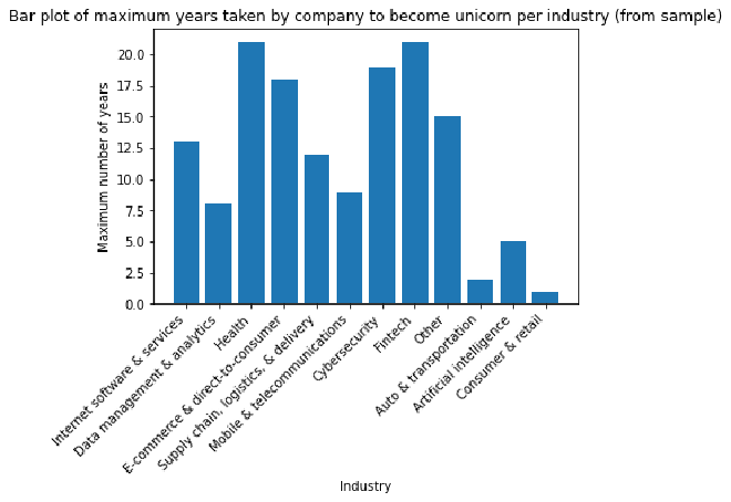
Visualize the time it took companies to reach unicorn status #
Visualize the longest time it took companies to reach unicorn status for each industry represented in the sample. To create a bar plot to visualize this, use the bar() function from the matplotlib.pyplot module.
# Create bar plot
# with Industry column as the categories of the bars
# and the difference in years between Year Joined column and Year Founded column as the heights of the bars

### YOUR CODE HERE ###

plt.bar(companies_sample["Industry"], companies_sample["Year Joined"] - companies_sample["Year Founded"])

# Set title

### YOUR CODE HERE ###

plt.title("Bar plot of maximum years taken by company to become unicorn per industry (from sample)")

# Set x-axis label

### YOUR CODE HERE ###

plt.xlabel("Industry")

# Set y-axis label

### YOUR CODE HERE ###

plt.ylabel("Maximum number of years")

# Rotate labels on the x-axis as a way to avoid overlap in the positions of the text

### YOUR CODE HERE ###

plt.xticks(rotation=45, horizontalalignment='right')

# Display the plot

### YOUR CODE HERE ###

plt.show()
Hint 1
Refer to what you have learned about creating bar plots as part of exploratory data analysis.
Hint 2
Use the function in the matplotlib.pyplot module that allows you to create a bar plot, specifying the category and height for each bar.
Use the functions in the matplotlib.pyplot module that allow you to set the title, x-axis label, and y-axis label of plots. In that module, there are also functions for rotating the labels on the x-axis and displaying the plot.
Hint 3
Use the plt.bar() to create the bar plot, passing in the categories and heights of the bars.
Use plt.title(), plt.xlabel(), and plt.ylabel() to set the title, x-axis label, and y-axis label, respectively.
Use plt.xticks() to rotate labels on the x-axis of a plot. The parameters rotation=45, horizontalalignment='right' can be passed in to rotate the labels by 45 degrees and align the labels to the right.
Use plt.show() to display a plot.
Question: What do you observe from this bar plot?
- This bar plot shows that for this sample of unicorn companies, the largest value for maximum time taken to become a unicorn occurred in the Heath and Fintech industries, while the smallest value occurred in the Consumer & Retail industry.
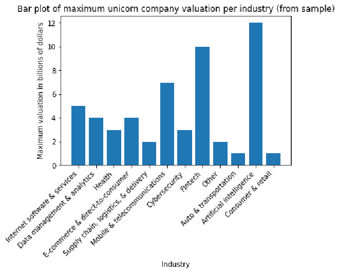
Visualize the maximum unicorn company valuation per industry #
Visualize unicorn companies’ maximum valuation for each industry represented in the sample. To create a bar plot to visualize this, use the bar() function from the matplotlib.pyplot module. Before plotting, create a new column that represents the companies’ valuations as numbers (instead of strings, as they’re currently represented). Then, use this new column to plot your data.
# Create a column representing company valuation as numeric data

# Create new column
companies_sample['valuation_billions'] = companies_sample['Valuation']
# Remove the '$' from each value
companies_sample['valuation_billions'] = companies_sample['valuation_billions'].str.replace('$', '')
# Remove the 'B' from each value
companies_sample['valuation_billions'] = companies_sample['valuation_billions'].str.replace('B', '')
# Convert column to type int
companies_sample['valuation_billions'] = companies_sample['valuation_billions'].astype('int')
companies_sample.head()
| Company | Valuation | Date Joined | Industry | City | Country/Region | Continent | Year Founded | Funding | Select Investors | Year Joined | valuation_billions | |
|---|---|---|---|---|---|---|---|---|---|---|---|---|
| 542 | Aiven | $2B | 2021-10-18 | Internet software & services | Helsinki | Finland | Europe | 2016 | $210M | Institutional Venture Partners, Atomico, Early... | 2021 | 2 |
| 370 | Jusfoun Big Data | $2B | 2018-07-09 | Data management & analytics | Beijing | China | Asia | 2010 | $137M | Boxin Capital, DT Capital Partners, IDG Capital | 2018 | 2 |
| 307 | Innovaccer | $3B | 2021-02-19 | Health | San Francisco | United States | North America | 2014 | $379M | M12, WestBridge Capital, Lightspeed Venture Pa... | 2021 | 3 |
| 493 | Algolia | $2B | 2021-07-28 | Internet software & services | San Francisco | United States | North America | 2012 | $334M | Accel, Alven Capital, Storm Ventures | 2021 | 2 |
| 350 | SouChe Holdings | $3B | 2017-11-01 | E-commerce & direct-to-consumer | Hangzhou | China | Asia | 2012 | $1B | Morningside Ventures, Warburg Pincus, CreditEa... | 2017 | 3 |
# Create bar plot
# with Industry column as the categories of the bars
# and new valuation column as the heights of the bars

### YOUR CODE HERE ###

plt.bar(companies_sample["Industry"], companies_sample["valuation_billions"])

# Set title

### YOUR CODE HERE ###

plt.title("Bar plot of maximum unicorn company valuation per industry (from sample)")

# Set x-axis label

### YOUR CODE HERE ###

plt.xlabel("Industry")

# Set y-axis label

### YOUR CODE HERE ###

plt.ylabel("Maximum valuation in billions of dollars")

# Rotate labels on the x-axis as a way to avoid overlap in the positions of the text

### YOUR CODE HERE ###

plt.xticks(rotation=45, horizontalalignment='right')

# Display the plot

### YOUR CODE HERE ###

plt.show()
Hint 1
Refer to what you have learned about creating bar plots as part of exploratory data analysis.
Hint 2
Use the function in the matplotlib.pyplot module that allows you to create a bar plot, specifying the category and height for each bar.
Use the functions in the matplotlib.pyplot module that allow you to set the title, x-axis label, and y-axis label of plots. In that module, there are also functions for rotating the labels on the x-axis and displaying the plot.
Hint 3
You can use the plt.bar() to create the bar plot, passing in the categories and heights of the bars.
You can use plt.title(), plt.xlabel(), and plt.ylabel() to set the title, x-axis label, and y-axis label, respectively.
You can use plt.xticks() to rotate labels on the x-axis of a plot. The parameters rotation=45, horizontalalignment='right' can be passed in to rotate the labels by 45 degrees and align the labels to the right.
You can use plt.show() to display a plot.
Question: What do you observe from this bar plot?
- This bar plot shows that for this sample of unicorn companies, the highest maximum valuation occurred in the Artificial Intelligence industry, while the lowest maximum valuation occurred in the Cybersecurity industry.
Considerations #
What are some key takeaways that you learned from this lab?
- Functions in the
pandaslibrary can be used to gather characteristics about the data at hand.- The
info()anddescribe()functions were especially useful for gathering basic information about a dataset and finding descriptive statistics, respectively.
- The
- Functions in the
matplotlib.pyplotmodule can be used to create visualizations to further understand specific aspects of the data.- The
bar()function allowed you to create bar plots that helped visualize categorical information about the data. You were able to visualize the maximum years to become a unicorn and maximum valuation for each industry represented in the sample taken from the data.
- The
What findings would you share with others?
- There are 1074 unicorn companies represented in this dataset.
- Some companies took longer to reach unicorn status but have accrued high valuation as of March 2022. Companies could take longer to hit unicorn status for a number of reasons, including requiring more funding or taking longer to develop a business model.
What recommendations would you share with stakeholders based on these findings?
It may be helpful to focus more on industry specifics. Next steps to consider:
- Identify the main industries that the investing firm is interested in investing in.
- Select a subset of this data that includes only companies in those industries.
- Analyze that subset more closely. Determine which companies have higher valuation but do not have as many investors currently. They may be good candidates to consider investing in.
References
Bhat, M.A. (2022, March). Unicorn Companies.